How To Use The Infamous 'Tropicana Rebrand Failure' To Catch Tiny Mistakes Before They Snowball
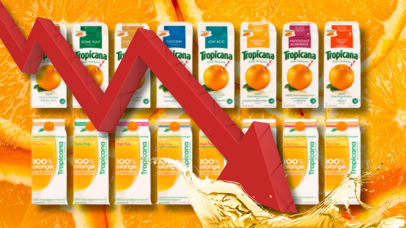
In the worst rebrand in the history of orange juice, Tropicana paid $35 million to then lose $20m in sales.
 tropicana | tropicana.com, tamanna_rumee, frender, pavlinec | Canva
 In hindsight, it’s easy to see why Tropicana’s 2009 rebrand failed. Poor design choices, a messy, vague, esoteric theme, and — as often with these things — a complete disregard for common sense.
When Tropicana hired legendary ad agency Arnell in 2008, they surely didn’t expect that, after five months of design work, launch planning, and $35 million in marketing spend, they’d lose 20% of their revenue within a month — about $20 million total in missed sales. But that’s exactly what happened.
Less than 30 days after launch, they pulled the new design off the shelves and went back to the old one. Four years later, Arnell shut down — they had been in business for three decades. Looking back, some of Arnell’s mistakes appear obvious.
Here's how to use the infamous 'Tropicana rebrand failure' to catch tiny mistakes before they snowball.
Without even getting into the subjective topics of visual appeal and recognizability, some technical design flaws present themselves instantly.
Take the logo, for example. Tropicana. It used to be bold, centered, and horizontal — easy to read when you’re standing three feet from the shelf.
After the rebrand, the font was thinner, the same color as the remaining text pushed to the side, and, worst of all, vertical. No matter how great your juice is, don’t force your customer to tilt their head sideways in the grocery store to read your name. It’ll make them feel stupid and potentially embarrassed.
Then, there’s visual ease. On the old packaging, each side of the carton relied on whole elements. The orange on the front, people on the side, and so on.
The new packaging tried to be clever. “Let’s put the glass across two sides. Nice visual effect!” The problem with visual effects is: If my perspective isn’t perfectly adjusted to the right angle, I can’t see it. How many times will you see a single carton of Tropicana, conveniently standing at a 45-degree angle, all by itself? Never — and the pretty visual effect is lost on most if not all customers.
Third, giving the most important product information its own, clearly marked space is just common courtesy.
The old design had a big, red box up top, like a warning sign almost. “No pulp.” Okay, got it, thank you. Where’s the level of pulp-ness on the new design? It’s not even there. There were other versions, but they just put “Pulp Free” in red inside the orange juice in the glass. That’s not nearly as distinguishable as a big, red box.
What’s more, white font on a yellow background is a weaker contrast than dark green on a white background — especially considering they stuffed it inside the juice glass. Talk about “hidden in plain sight.”
Beautiful design is important, but if it’s not functional, it won’t matter.
In Tropicana’s case, customers literally couldn’t find the product they already wanted to buy on the shelves. That’s ludicrous.
You need to make sure you convey the right information to your customer and do it quickly. Consumer choices are split-second decisions. Only after you’ve ensured a proper flow of data can you get into the nitty-gritty of “nice visual effects.”
Of course, this is a back-and-forth process. Information, presentation, information, presentation — eventually, you’ll arrive at something that’s both beautiful and functional. Tropicana tried to be too much of the former at the expense of the latter — and it only got messier from there.
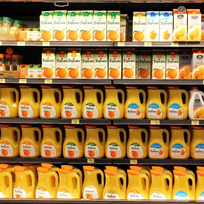
Tropicana took a remarkable, characteristic brand look and replaced it with a bland, average-joe design that would instantly disappear in the masses of no-name juice boxes that populate every grocery store shelf. The orange with a straw was iconic. No one else had it. Any customer would automatically associate it with Tropicana and remember it, and, as long as the juice didn’t taste terrible, that was enough!
 Niloo | Shutterstock
Shoppers are loyal creatures. We don’t like experimenting in aisle three when our grocery list still has 17 more items to pick up. We want our juice. The juice that we’re used to. And we don’t want to go on a scavenger hunt to find it.
Once Tropicana was in people’s minds thanks to the orange, it was easy to stay there. Remove the orange, and poof, in an instant, you’ve destroyed that entire relationship.
Of course, Arnell wasn’t thinking about any of that.
They were thinking about symbolism, about love, about all the wonderful things they could imply with a new design. Unfortunately, no one got the joke, which turned out to be, ultimately, on them.
Their CEO and founder, Peter Arnell, was majorly involved in the rebrand. In his words, “We thought it would be important to take this brand and bring it or evolve it into a more current or modern state.”
Uh-oh. If you’re wondering when it would have been time for Tropicana execs’ alarm bells to ring, this would be it. Jargon is rarely a good sign.
In this case, “modern” was just synonymous with “bland.” 'Let’s do what everyone else is doing.' But If your whole reputation is built on sticking out, that’s not a good idea.
Peter Arnell was the P.T. Barnum of advertising at the time, and there’s a good chance he single-handedly drove this rebrand into the ground.
“One criticism was that his thinking was too esoteric and design-sense so dreamlike — to the point that it lacked the practicality that marketers pride themselves on,” AdAge commented on the closure of his company in 2013.
Arnell’s explanations of the redesign reveal his lack of realism: “Historically, we always show the outside of the orange. What was fascinating was that we had never shown the product called the juice.” Really? I mean, it’s juice. Give me a clear symbol of it, and I’m good to go. And what could be clearer than the actual fruit the juice is from?
A yellow-colored liquid, on the other hand, is open to lots of nice — and not-so-nice — interpretations. Especially when you put it in a cocktail glass. Are they selling mixed drinks now? The new design’s symbolism was confusing, and it seems to have been a reflection of Arnell’s confused state of mind.
Then, there was the squeeze. Arnell wanted to base their campaign on the theme of love. The slogan on the posters was “Squeeze — It’s a natural.” The images of families hugging were nice, and that tagline may have flown in the vanilla world of 2009, but it’s hard to beat “Pure Premium” as a standard you’re upholding, both in clarity and power. I want pure juice, and I want it to be premium. What else do I need?
The one thing I’ll give them credit for is the cap of the new carton. It had the haptic structure of an actual orange. “We engineered this little squeeze cap so that the notion of squeezing the orange was implied ergonomically.” That was a nice touch — and the only thing that would remain after the fiasco.
Tropicana added the new cap to the old design and, soon, sales recovered. Still, at over $50 million in cost, that’s one heck of a price for a new lid.
The most fascinating thing about grand-scale failures is how a truckload of small mistakes quietly sneaks by dozens, sometimes hundreds of people without anyone realizing the huge disaster in the making.
Then, on launch day, the sum of those mistakes is dumped into the world. In an instant, catastrophe ensues — and no one saw it coming.
In the case of Tropicana — and any other rebrand, really — there would have been a simple way to avoid losing all those dollars. No one knows for sure, but I’m pretty certain that, in all their market research, Arnell never once made a simple graphic and showed it to an actual customer. I’m sure this would have revealed a broad trend of disapproval. At the very least, many “meh”s and “nah”s might have pointed out some of the many flaws in Tropicana’s new carton, and the disaster might not have been as bad.
Take your design, and show it to people. That’s only one of many lessons to be learned from this $50 million debacle.
- When a marketer lacks common sense, and realism, and is “totally out there” in his vision, don’t give him free rein for a commodity, an everyday product.
- Don’t overthink — especially not your designs. In most products, consumers value practicality and simplicity over abstract concepts and emotional obstacle courses.
- When you’ve secured a rare, treasured spot in customer's hearts by standing out, don’t suddenly try to fit in.
- Don’t let beautiful design distract from what’s important: Communicating the right information to your customer at the right time.
When you see a looming disaster, don’t stick your head in the sand. Raise your hand and say, “Wait a minute! That just looks wrong.”
You don’t have to be a big wig or use jargon to get that message across. A simple saying will do it. A simple saying, such as: If it ain’t broke, don’t fix it.
Niklas Göke writes a daily blog for dreamers, doers, and unbroken optimists.
